New technology is part of the reason logos have undergone some dramatic evolutions over the years. But it’s mostly because these companies and their brands have changed over time.
Apple Logo Evolution

The original logo was designed by Steve Jobs and Ronald Wayne and it depicted Isaac Newton sitting under the infamous apple tree. Then, Rob Janoff designed the first rainbow Apple logo with a bite out of it so it wouldn’t be recognized as another fruit.
Microsoft Logo Evolution

The Microsoft employees referred to the “O” in the green logo as “blibbet” and they even had a double cheeseburger in the company cafeteria that was called the “Blibbet Burger”.
Yahoo! Logo Evolution

If you click the “!” in the logo on yahoo.com, it sings, “Yahooo-oo-ooo.”
UPS Logo Evolution

The original logo features an eagle carrying a package with the words, “Safe, Swift, Sure” inscribed on the side.
IBM Logo Evolution
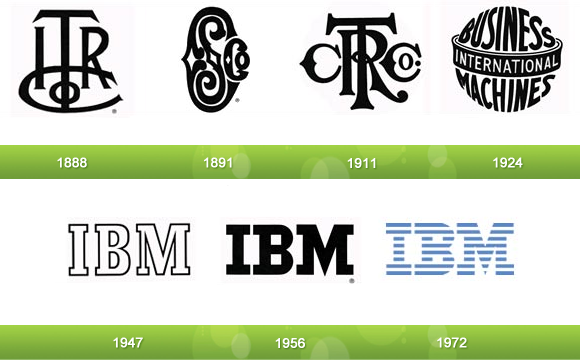
Both the current IBM and the third UPS logo were designed by the same guy, Paul Rand. He also created the logos for Enron, ABC, and Steve Jobs’ NeXT.
Xerox Logo Evolution
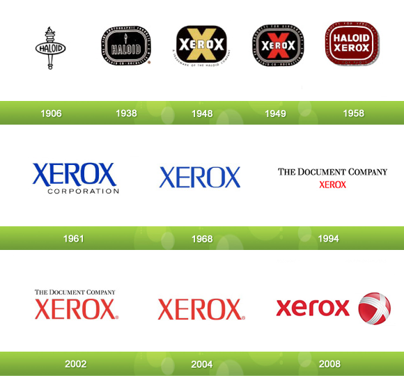
Haloid invested in Chester Carlson’s xerography (aka photocopy) invention in 1938 and it became the most successful division of the company so they switched the name and logo.
Kodak Logo Evolution

Kodak was originally called “The Eastman Kodak Company,” hence the “EKC” in the original Kodak logo.
Canon Logo Evolution

Their first camera was named, “Kwanon,” after the Buddhist goddess of mercy. The original logo was a picture of this goddess with 1000 arms and flames.
Nokia Logo Evolution

As the oldest original logo in this list, it depicts an image of a fish because Fredrik Idestam founded the company as a wood pulp mill on the banks of the Tammerkoski Rapids.
BP Logo Evolution
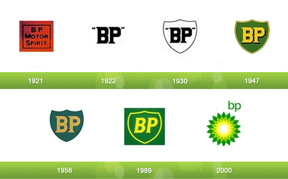
BP’s logo was largely unchanged through its first 80 years until they introduced the Helios symbol in 2000 to represent their commitment to producing energy in all of its many forms.
Shell Logo Evolution
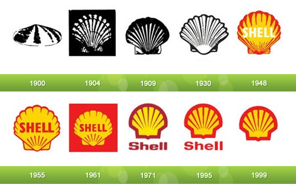
The 1958 BP logo and 1971 Shell logo were designed by the same guy, Raymond Loewy, who also designed the Exxon logo.
Ford Logo Evolution
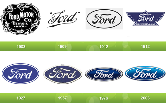
The 1909 logo was created with Childe Harold Wills’ font that he originally developed for his business card.
Volkswagen Logo Evolution

I know what you’re thinking. Why does the original Volkswagen logo slightly resemble the Nazi symbol? Well, that’s because Hitler had a hand in founding the company. Naturally, Volkswagen phased out that part of the logo and stuck with the center.
Mercedes-Benz Logo Evolution
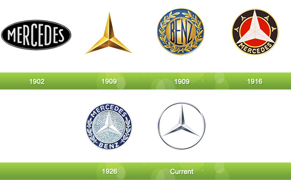
The three pointed star represents their original intent to make vehicles in land, water, and sky.
Audi Logo Evolution
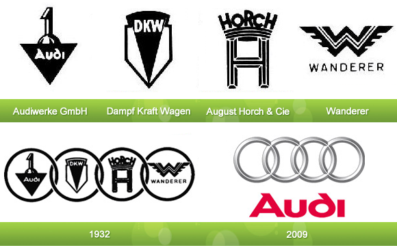
The four circles represent how Audi started as a merger of the four above companies.
Pepsi Logo Evolution
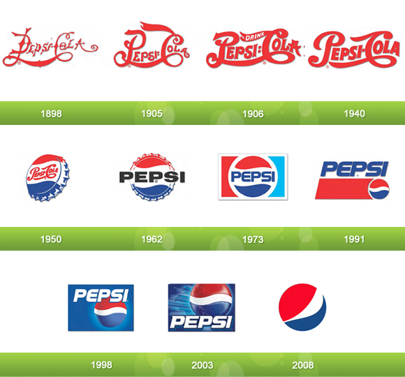
In 1941, Pepsi adopted the colors red, white, and blue to commemorate the war efforts of the United States.
Mountain Dew Logo Evolution

Mountain Dew was originally invented as moonshine by a couple of Tennessee hillbillies with the tagline, “It’ll tickle yore innards!” This is represented in their original logo.
You can likewise coordinate symbols - a huge number to look over are normally accessible inside the program. logo design service
ReplyDelete